✏️ EDITED TO SUPPORT VERSION 1.0
For impatient folks (like me), you can 🎁 Grab the Github repository right now.
Every landing page needs a robust navigation bar (or header) component that adapts to all the different displays.
In this tutorial, we'll build together a NavBar component using the Chakra UI library in React.
Installation
We'll create a new project using create-react-app and name it header-chakra-ui (or anything).
npx create-react-app header-chakra-ui
cd header-chakra-ui
Next, we'll install the Chakra UI library and its dependencies.
npm i @chakra-ui/react @emotion/react @emotion/styled framer-motion

# or

yarn add @chakra-ui/react @emotion/react @emotion/styled framer-motion
For setting up the Chakra UI with React we'll need its ChakraProvider and optionally a custom theme. You can check my previous article about the complete installation.

Define the variants
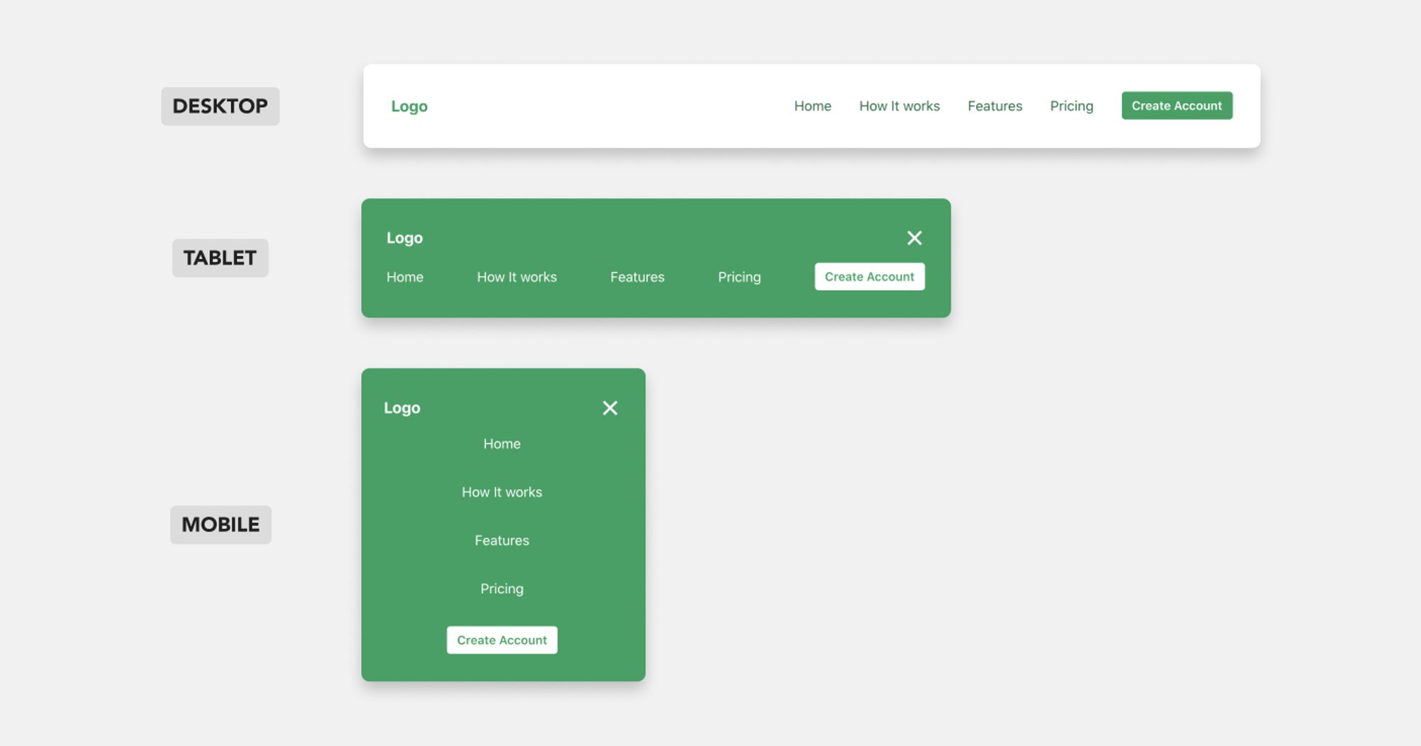
We need three different variants for our NavBar components. One for each of the main device sizes (mobile, tablet, desktop).

A good practice, I usually follow before jumping into coding, is to separate the individual parts (or components) that compose the design.
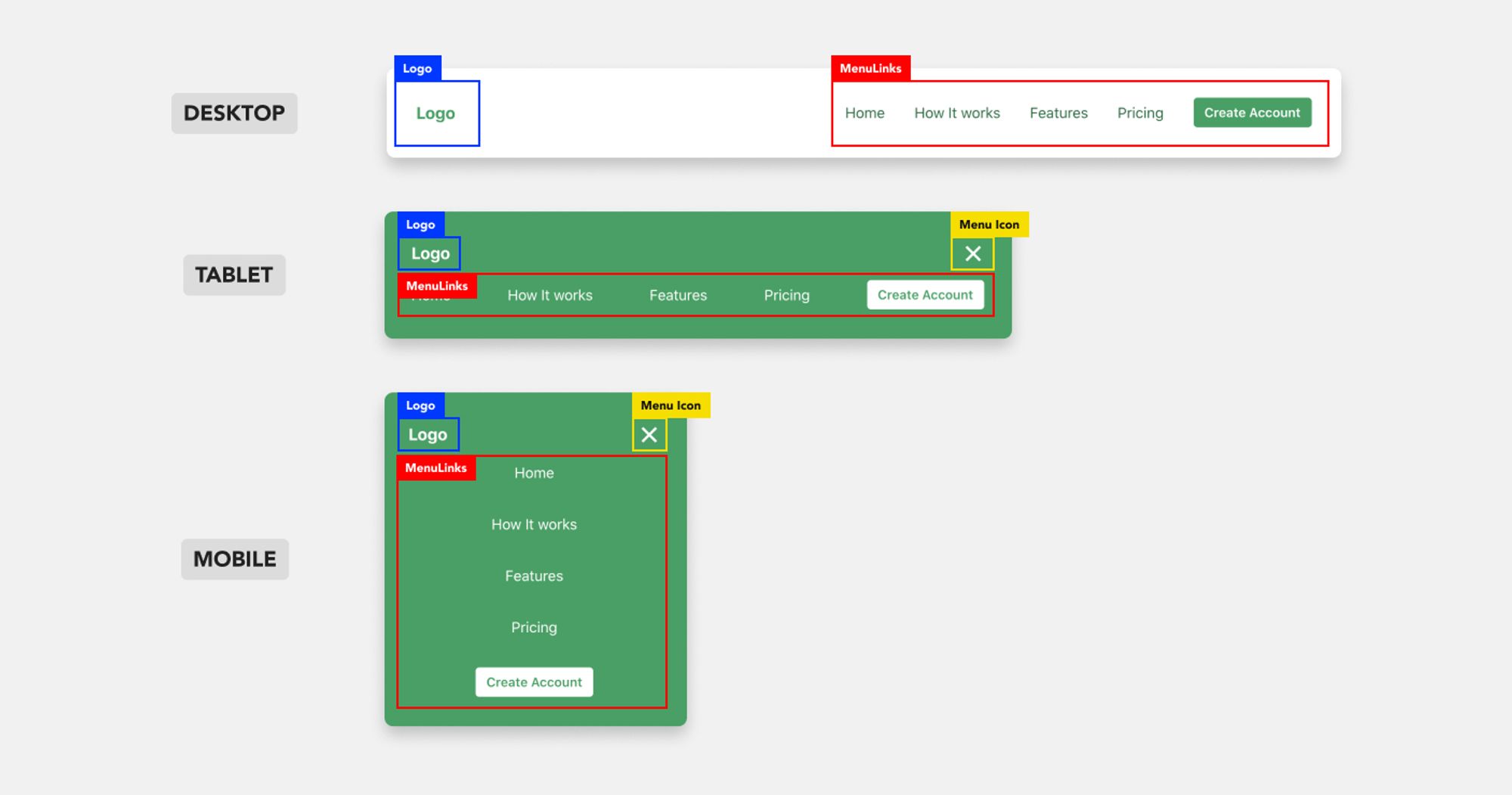
In the specific case, we'll need three basic sub-components:
- The Logo
- The MenuToggle button\\ (which is not visible on the desktop version), and
- The MenuLinks are distributed horizontally on desktop and tablet screens and vertically on mobiles.
To help you visualize this process with more clarity, I highlighted the components in the image below.

To implement these 3 variants, we'll use the Chakra UI responsive styles. Learn how they work at the official Chakra UI docs.
Create the Logo component
To simplify the tutorial, I add a Text component as a Logo and wrap it with a Box. But you can add an Image or an SVG icon as well.
import React from "react"
import { Box, Text } from "@chakra-ui/react"

export default function Logo(props) {
  return (
    <Box {...props}>
      <Text fontSize="lg" fontWeight="bold">
        Logo
      </Text>
    </Box>
  )
}
Create the MenuToggle button
The MenuToggle button is the button at the top right corner of our interface. Its' purpose is to toggle the visibility of the MenuLink component for mobile and tablet devices.
When the menu is open, we need to show the close icon. When the menu is closed, we must show the menu icon.
Also, we need to set the display attribute to none for screens larger than the md breakpoint (desktop devices).
import React from "react"
import { Box } from "@chakra-ui/react"

const MenuToggle = ({ toggle, isOpen }) => {
  return (
    <Box display={{ base: "block", md: "none" }} onClick={toggle}>
      {isOpen ? <CloseIcon /> : <MenuIcon />}
    </Box>
  )
}
I highly recommended installing the react-icons library to add the two icons into your application. Otherwise, we can
Since, the isOpen variable and the toggle function need to be accessible by the parent component as well (conditionally render the MenuLinks), we define it there and pass them as props to the MenuToggle component.
const Header = () => {
  const [isOpen, setIsOpen] = React.useState(false)

  const toggle = () => setIsOpen(!isOpen)

  return(
    ...
    <MenuToggle toggle={toggle} isOpen={isOpen}
    ...
  )
}
Build the MenuLinks components
It's the part of the NavBar that includes the navigation links and CTA button(s).
To make it robust, we need to create another sub-component, the MenuItem component and fine-tune the styling props of the container.
The MenuItem is a simple component that wraps the passed child with a Link component. For this tutorial, I use the Link component from Chakra UI. But you may use the Link component from your desired framework/library eg. Next.js, Gatsby, react-router.
const MenuItem = ({ children, isLast, to = "/", ...rest }) => {
  return (
    <Link href={to}>
      <Text display="block" {...rest}>
        {children}
      </Text>
    </Link>
  )
}
Then, we need to stack the MenuItem components horizontally or vertically, depending on the active screen size.
To achieve this tricky goal, we use the Stack component that automatically adjusts the spacing between its children.
<Stack
  spacing={8}
  align="center"
  justify={["center", "space-between", "flex-end", "flex-end"]}
  direction={["column", "row", "row", "row"]}
  pt={[4, 4, 0, 0]}
>
  <MenuItem to="/">Home</MenuItem>
  <MenuItem to="/how">How It Works</MenuItem>
  ...
</Stack>
As you can see, we adjust its direction and justify properties according to our desired breakpoints.
The final step here is to wrap the Stack component with a Box. The goal here is to force the MenuLinks component to a new line by changing the display and flex-basis CSS rules on mobile and tablet screens.
<Box
  display={{ base: isOpen ? "block" : "none", md: "block" }}
  flexBasis={{ base: "100%", md: "auto" }}
>
  ...
</Box>
And the NavBarContainer
Basically, it's the component that wraps everything else.
You can tweak the background and text color of the NavBar, add padding around it!
The space-between attribute of the Flex component makes sure content will be aligned on the edges eg. Logo on the left and Menu on the right.
const NavBarContainer = ({ children, ...props }) => {
  return (
    <Flex
      as="nav"
      align="center"
      justify="space-between"
      wrap="wrap"
      w="100%"
      mb={8}
      p={8}
      bg={["primary.500", "primary.500", "transparent", "transparent"]}
      color={["white", "white", "primary.700", "primary.700"]}
      {...props}
    >
      {children}
    </Flex>
  )
}
And you have a robust, fully-responsive NavBar component for your landing page or application.
Sum up
The final NavBar component looks pretty simple and clean, huh?!
const NavBar = (props) => {
  const [isOpen, setIsOpen] = React.useState(false)

  const toggle = () => setIsOpen(!isOpen)

  return (
    <NavBarContainer {...props}>
      <Logo
        w="100px"
        color={["white", "white", "primary.500", "primary.500"]}
      />
      <MenuToggle toggle={toggle} isOpen={isOpen} />
      <MenuLinks isOpen={isOpen} />
    </NavBarContainer>
  )
}Don't miss out on the upcoming exciting posts about Chakra UI by subscribing to my newsletter.

.jpg?table=block&id=5da08adb-020e-442d-ba9a-9618414c7311&cache=v2)
.webp?table=block&id=2442a2a4-3cc1-49ef-92a1-eb8fb9949d7b&cache=v2)


