✏️ EDITED TO SUPPORT VERSION 1.0
If you’re impatient like me, grab the Codesandbox code right away.
Introduction
Chakra UI is a modern React UI library. It provides a set of accessible, reusable, and composable React components that make it super easy to create websites and apps.
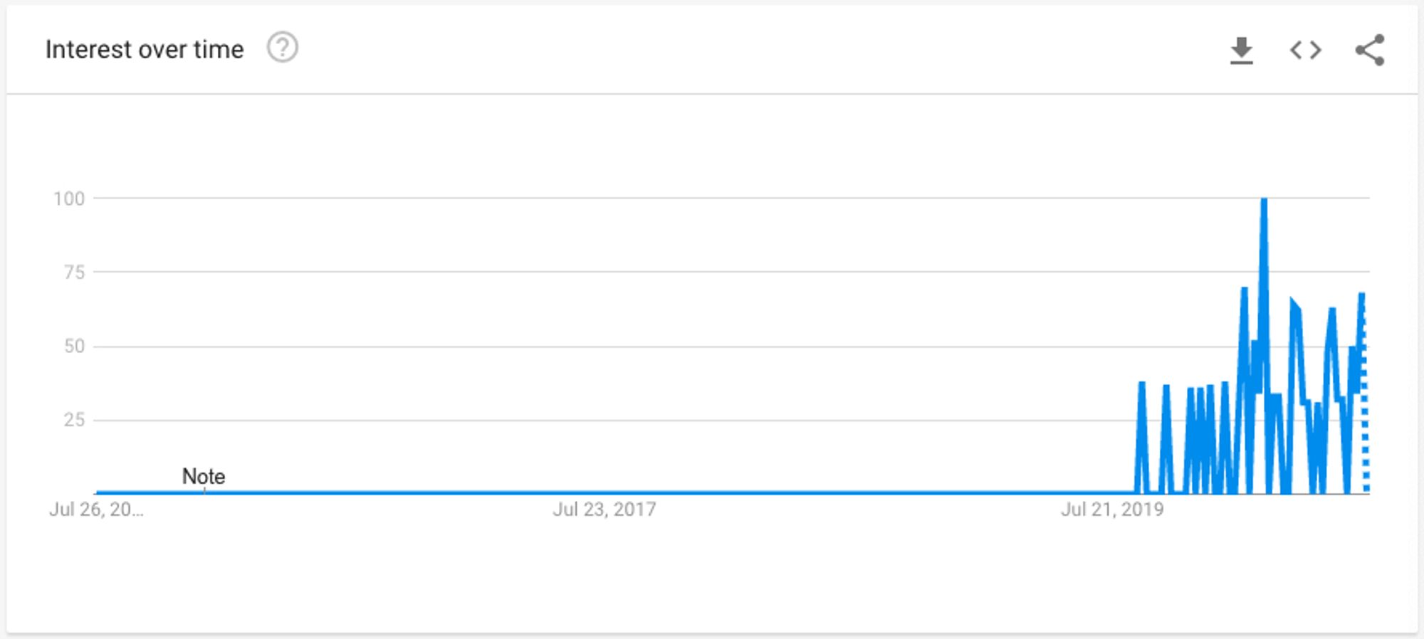
The last year, Chakra UI gained a lot of traction and the hype is building around the library.

In the past few years, I’ve used a couple of different UI libraries (Material UI, Semantic UI, Ant Design, Grommet etc.) but most of them didn’t fit my goals. The main problem was the difficulty to apply custom styling and handle the UI layout.
It’s not weird though since these libraries are derived by large teams that want to keep their components consistent across their codebase.
Finally, I decided to get my hands dirty and give it a try and I’m amazed. The ability to compose custom components and styling on the fly along with the accessibility props make Chakra UI a powerful alternative.
Today, I will guide you on how to set up Chakra UI using the create-react-app generator.
Create a new project
The easiest way to generate a React project is by using the Create React App. Replace the demo-app text with your app’s name.
npx create-react-app demo-app
cd demo-app
Install Chakra
Then, we have to install the Chakra UI library version 1 and its dependencies.
npm i @chakra-ui/react @emotion/react @emotion/styled framer-motion

# or

yarn add @chakra-ui/react @emotion/react @emotion/styled framer-motion
Add the ChakraProvider
Your first action is to wrap your application with the ChakraProvider component that includes all the appropriate styling for your components. Do this in your index.js file.
It's optional but you can pass as a prop a custom theme object that overrides Chakra's default theme options. It's a great way to add custom color palettes, custom breakpoints for responsiveness and other options.
import React from "react"
import { ChakraProvider } from "@chakra-ui/react"
import customTheme from "./customTheme"

return <ChakraProvider theme={customTheme}>{props.children}</ChakraProvider>
About your custom theme, you can easily add a custom palette. CopyPalette app can be handy for the palette generation.
Below, I show an example custom theme file that appends a primary color palette (You'll see next how to use it).
import { extendTheme } from "@chakra-ui/react"

const colors = {
  primary: {
    100: "#CFD1FD",
    200: "#A7ABFB",
    300: "#8388F9",
    400: "#6268F8",
    500: "#444BF7",
    600: "#262EF6",
    700: "#0B14F5",
    800: "#0911DD",
    900: "#080FC7",
  },
}

const customTheme = extendTheme({ colors })

export default customTheme
Ready to add Chakra components
At this point, the basic setup is completed. You should be able to add successfully the Chakra UI components.
For demonstration, we'll add two typography components <Text>, <Heading>, and a <Button> wrapped by a Stack component. At the same time, we'll utilize the custom primary color palette we added earlier.

Stack is a layout utility component that makes it super easy to stack elements together and apply a space between them. The spacing prop is the one that defines the spacing between components. It accepts all the valid Styled System props too.
About the custom colors, you can easily apply them as a string by specifying its name e.g "primary" and the desired tint/shade e.g. "primary.500".
One tricky point here is that the default style props need the color explicitly defined e.g. bg="primary.500".
Whereas the button component needs only the name of the color family (aka colorScheme) e.g. colorScheme="primary" and handles internally the color shades/tint for its states (wow huh?!).
import { Button, Heading, Stack, Text } from "@chakra-ui/react"

return (
  <Stack spacing={4} bg="white" p={8} borderRadius="lg">
    <Heading as="h1" size="md" color="primary.900">
      Chakra UI is rad!
    </Heading>
    <Text as="p" fontSize="md" color="primary.500">
      Here are your first Chakra components:
    </Text>
    <Button colorScheme="primary" isFullWidth>
      Click me, please!
    </Button>
  </Stack>
)
Up to this point, you're ready to apply your own styles and explore their rich component gallery!
Have fun and share with me your creations by tagging me @d__raptis on Twitter 💪

.jpg?table=block&id=5da08adb-020e-442d-ba9a-9618414c7311&cache=v2)
.webp?table=block&id=2442a2a4-3cc1-49ef-92a1-eb8fb9949d7b&cache=v2)


